
Parachute
Sync Agency
Parachute Sync Agency, an independent sync agency based in Denmark, represents a diverse portfolio of Nordic indie music labels, publishers, and talented artists. Mathias wanted a personal brand identity that would resonate with clients and artists alike.
-
Logo design
Visual identity development
Typography selection
Instagram strategy & content
Animated webpage elements

-
A POWERFULL SYMBOL
The brandmark is designed to resemble a minimalistic parachute. It is a representation and a powerful emblem of the core value within the agency:Providing a safety net with support system, while empowering artists to explore new heights and break free from creative constraints
-
A BOLD CLEAN AND CLASSIC FONT
Pared with the minimalistic brandmark, is a clean bold and powerful font - stating the brand has impact, strength and confident.


Social media
strategy


The client wanted the flexibility to create content across various media platforms, seamlessly incorporating logos, colored backgrounds, and information organized into different topics.
-
To address the client's needs, I created customizable templates for easy insertion of inspirational messages, updates, and content, ensuring consistent branding and streamlined content creation across platforms.
Designing distinctive Instagram highlight icons for Parachute Sync Agency enhances its online presence by categorizing and symbolizing stories, making key content accessible and memorable. These icons reflect the agency's core values: liberation, adventure, harmony, and exploration, strengthening the brand's narrative and resonating with both artists and clients, while enhancing aesthetic appeal and engagement.
CORE VALUES


Together, these values create a holistic approach to artist representation, positioning Parachute Sync Agency as a trusted partner that not only supports but also elevates its artists. This alignment with the symbolism of a parachute—offering safety, support, and the ability to soar to new heights—reinforces the agency's commitment to helping artists achieve their dreams and navigate the unpredictable terrain of the music industry.


ANIMATED WEBPAGE ELEMENT
An animated graphic is crucial for the brand's webpage, mirroring the rhythmic pulse of music. It captures Parachute Sync Agency's vibrancy and energy, engaging visitors with motion and visual storytelling. This dynamic element enhances user experience with depth and interactivity, reinforcing the brand's commitment to creativity and innovation in the music industry.
COLOR
THEORY
In selecting the color palette for Parachute Sync Agency, I aimed to create a vivid and dynamic visual identity that would resonate with the agency’s diverse representation of genres within the music industry.
COLOR THOUGHTS







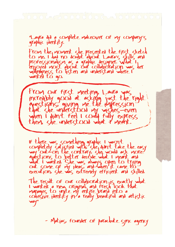

Matias / Founder of Parachute Sync Agency
